Physicists
Visualizing an entirely new subject
Overview
Roles
Research / Data Visualization
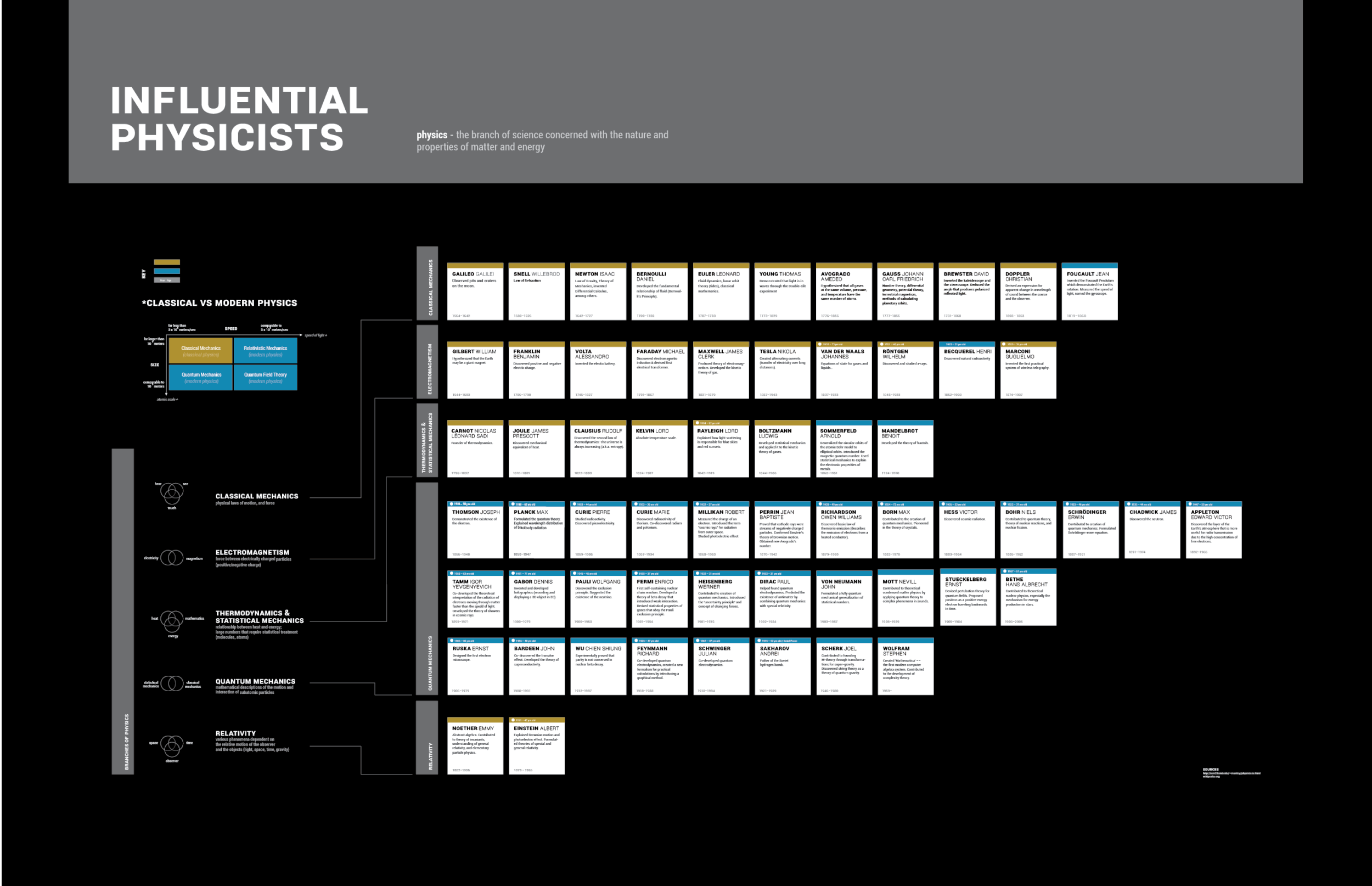
A simple visualization of influential physicists developed to aid students with a paper to write and nowhere to start.
From this visualization you will be able to know the following about a particular physicist:
- Type: Classical or Modern
- Which branch of physics
- Date of birth, date of death
- Contribution to the development of the field
- Recipient of a noble prize and age at which s/he received it
Poster
Click to enlarge
Concept
I stumbled across the above illustration and it fascinated me. I was inspired to make a map of physics as it had developed, but it proved too difficult for a novice who had never taken a single class in basic physics.
Hence began a long search for something I could map. A few forays into Wikipedia, some choice university websites, and I made rough divisions for the branches of physics.


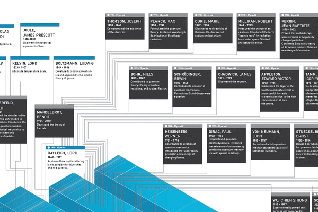
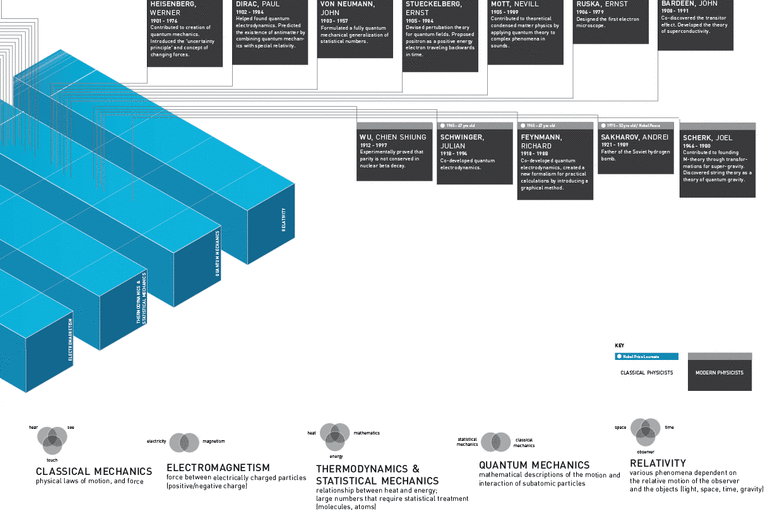
Each physicist was painstakingly documented with their notable contributions, country of origin, birth date - death date, and if they had won a noble peace prize, that as well. From there I sorted each physicist into branches of physics as I understood it: classical mechanics, electromagnetism, thermodynamics & statistical mechanics, quantum mechanics, and relativity.
Iteration
The audience was not well-defined for this iteration. Who could use this, and how? What purpose or function did this visualization serve?
My own criticism led me to the following points:
- It looks like classical physicists are good and modern physicists are evil; the use of color needed to be revisited.
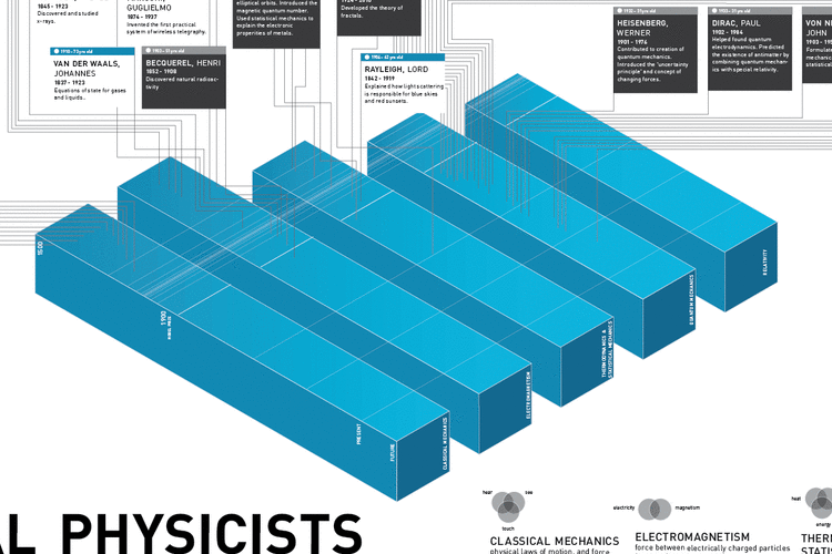
- The blue bars were not fulfilling their purpose; that is, to distinguish between branches of physics and to show the parallel development of physics. Rather, they made it more difficult to see who lived at what time period-- something that should be easy to distinguish.
- The entire poster was crowded and difficult to navigate.
I realized I needed to take a step back. There was no need to overcomplicate the data visualization. I went back to the post-its and studied them, eventually deciding that they were the clearest and best way to visualize the information I had gathered. For the audience I had in mind, a reference sheet was the best way to portray the map of influential physicists.